CSS/SCSS Guidelines (refers to SMACSS methodology)
Naming:
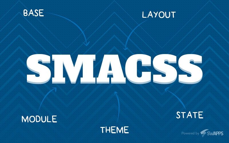
For naming things, We should refers to SMACSS methodology (http://smacss.com), please apply as much as possible.
And keeps in mind for the basic uses:
The example:
The wrapper of the widget will describe the name of the widget itself, and for all below of the widget will use the abbreviation from the name of the widget.
.widgetname OR .widgetnamewrapper (for the wrapper), then for the element under the widget will be like:
.wgtnme-item
.wgtnme -list
.wgtnme-image
etc.
Nesting element or class name:
Please avoid heavy nesting element under a class name, and please add class name on every single different/specificity elements.
Take a look this simple explanation:
Not correct:
.widgetclassname {

div {

/**/

. wdgtclsnm-input {

/**/

}

. wdgtclsnm-button {

/**/

}

label {

/**/

}

}

}
Correct:
.widgetclassname {

/**/

}

.wdgtclsnm-detail {

/**/

}

.wdgtclsnm-input {

/**/

}

.wdgtclsnm-button {

/**/

}

.wdgtclsnm-label {

/**/

}
Theming:
Almost the project is THEMABLE (theme is applied to a site according to the client’s theme), therefore, must be considered when using variables for the color elements, border color, background color and others that use the global variable such as: $brand-primary, $brand-success, $brand-info, $brand-warning , $brand-danger, $border-color, $border-secondary, $color-primary, $color-secondary, $color-link, etc., please note that it should be defined in the actual skin file ([path]/ skins / *. SCSS), pick a file based on categorizing files (please refer to how SMACSS handle this : https://smacss.com/book/type-theme)
Variables:
Don’t ever use direct value for color and background, please use the variables that have been provided:
“[path]/_variables.scss”
“[path]/_customVariables.scss”
If you cannot find the color from design against provided variables, if it is frequently used, you can add new variable and make sure it applied to whole client’s skins, otherwise using “darken” and “lighten” is also allowed.
Sample:
color: darken($brand-primary, 10%);
color: lighten($link-color, 20%);
Alphabetical:
To be considered when writing code and put the import file are sorted in alphabetical order, this will be very helpful when managing the files and code.
SCSS Folder Structures:
- Base (this contains the typography and the reset).
- Components (this contains the component stylesheet, DON’T forget all code here are written in global and reusable in several sections in a page).
- Frameworks (this contains the bootstrap’s import and the custom variables ).
- Helpers (this contains the helper files such as animation and SCSS mixins ).
- Layout (This contains the layout for all view files, which they inherit.
- Files created in here are available across all the view files.)
- Pages (this contains a specificity of stylesheet for a page and specificity of extending and overriding stylesheet of element, widget and module per page)
- Skins (this contains the themes and skin)
- Vendor (this contains CSS from 3rd parties )
With some project we used the icomoon.
How to extending icomoon’s icons:
- Not Correct:
.className {
        content: "\e908";
        font-family: 'icomoon';
}
- Correct:
.className {
        @include extend-icomoon;
        @extend .icon-*(classname);
}
The explanation:
when we adding new icon, the value of icon’s content (content: "\e908") will be changing.
Media Queries:
Use media queries from “[path]_mixins.scss” for breakpoints on mobile